Agency's Mentorship Data Dashboard Design & Research
Role: Lead UX Researcher & Designer
Industry: Learning & Development
Research Type: Exploratory UXR + Iterative MVP Design
Methodologies: Stakeholder Interviews, User Interviews, Literature Review, Prototype Testing.
TL;DR:
I lead a project to research, design, and prototype an automated data analysis workflow for an internal mentorship program at a mid-sized agency.
Collaborating with a senior data scientist, I crafted an MVP data pipeline and dashboard which was human-centered, easy to use, and able to measure the success of 1:1 mentorship pairings at scale within the client’s organization.
Goals:
I lead this project from end-to-end, beginning with research and ending with the design of a data pipeline and dashboard for a peer-to-peer mentorship program. Our goals were to:
- Design data-driven behavioral analysis dashboard to measure success of 1:1 peer mentorship program.
- Develop human-centric KPIs for each pair's relational health and overall project effectiveness.
- Develop low-maintenance data pipeline via Google Forms surveys.
Challenges:
We faced an uphill battle with several complications on this project, such as:
- Leading a project intended to quantify the qualitative
- Groundbreaking concept with few existing outside comparisons
- Limited budget
- Small team collaborating between US and UK time zones

Process:
Our project can be broken down into three parts: discovery research, iterative design, and data pipeline creation.
DISCOVERY
- 6 Stakeholder interviews to understand project goals and long term intent of the project
- 16 User interviews with current and past mentors and mentees to investigate the program's current state strengths and weaknesses
- Secondary research into corporate Learning & Development (L&D) products and programs
- Secondary research into academic field of personal and professional growth measurement theories
- Did a comparative analysis of other dashboards and apps which display personalized data over time
DESIGN
- Designed low-fidelity dashboard wireframes for feedback
- Created new dual-view dashboard based on input from stakeholders
- Collaborated with product designer to refine high-fidelity prototype
- Oversaw coding of prototype into Google's Looker Studios

DATA PIPELINE
We created a set of human-centric qualitative KPIs to track mentor and mentee's growth, motivation, and satisfaction over time. Here's how we made it work:
- Crafted a carefully worded set of questionnaires to align to success KPIs.
- Fed these scores automatically into the pipeline's algorithm for analysis.
- Implemented statistical methods such as Weighted Averages, Harmonic Mean, and Dyadic Data Analysis into survey workflow for quantitative robustness.
- Oversaw coding of survey pipeline into Google's Looker Studios.

Impact:
The mentorship program has continued to grow and mature since the completion of our project. We accomplished the following:
- Applied academic rigor to an informal mentorship system.
- Educated stakeholders on the Hawthorne Effect, a social phenomenon where individuals modify an aspect of their behavior in response to their awareness of being observed.
- Designed the data pipeline to take advantage of this Hawthorne Effect by tailoring the questionnaires and qualitative KPIs to invite the participants to self-reflect.
-
Enabled the manager running the mentorship program to more accurately gauge the effectiveness and future trajectory of the program.
Learnings:
This was my first chance getting to collaborate with a mathematician/data scientist, and I learned a lot from this project, especially on the quantitative side of UX:
- "If you can't measure it, you can't improve it" — Peter Drucker
- Qual and quant can work together harmoniously to generate better research outcomes than working in silos.
- Behavioral analysis is sometimes more of an art than a science.
- You can't easily measure a user's subjective experience; you're only able to measure a user's self-reported assessment of that experience.
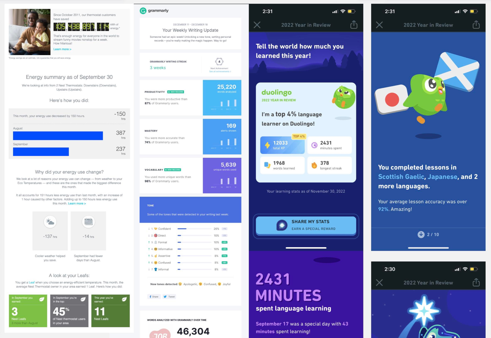
Note: As a researcher and strategist at a UX consultancy, I’m unable to share actual research findings or data visualizations due to NDA. The images you see are facsimiles based on original documentation.
